Relationships
Altering the context
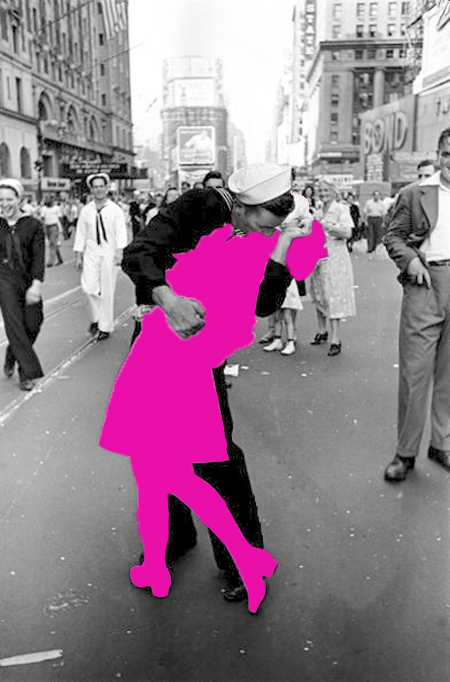
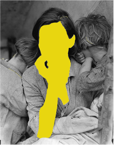
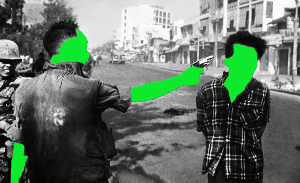
In the series 'Party', Ghasemi alters what look like ordinary, spontaneous snapshots by blocking out exposed areas of peoples skin. By censoring his own images, he protects the identity of individuals photographed at these private parties that are banned in Iran. These pictures evoke the censorship of imported magazines in Iran, where skirts are lengthened and women’s bodies are covered with strokes of black marker.


I also attempted to alter the context of some photos we were given in class. I decided to use Ghasemi's work as inspiration and recreated his technique of blocking out peoples flesh and faces to conceal their identity. I feel that by doing this it draws the eye away from the main focal point of the photograph and allows people to look more at the context in which the photo has been taken allowing them to create a fuller idea of what the picture is about. I did this by first choosing the image i wanted to edit and then using the quick select tool i selected the area of the photo that i wanted to block out. Once i had selcted a section of the photo i was happy with i chose the fill option under the edit tab and then chose a colour to fill in the selected area with and pressed okay. Below are some examples of the edits i did in class.
|
|
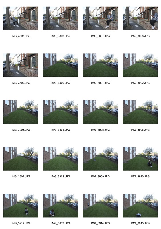
Childhood memories- ariel shots
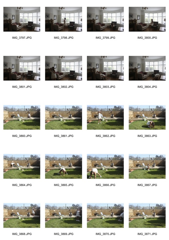
Jan von holleben
Born in 1977 and brought up in the southern German countryside, Jan von Holleben lived most of his youth in an alternative commune and identifies a strong connection between the development of his photographic work and the influence of his parents, a cinematographer and child therapist.
Response to Jan Von Holleben
I attempted to recreate jan's work using a ladder and a few props. I took these ariel images which create the illusion of people flying and fighting.
Film noir
Film noir is a cinematic genre which was very popular during the 50's. It uses a lot of dramatic lighting and shadows to create mysterious and glamorous images. I tried to recreate these images by setting my camera to the monochrome setting and then dressing my model in 50's fashion. However the lighting was quite bright and so i was unable to recreate the contrasts between light and dark so i tried to use photoshop to adjust the levels and exposure to try and create these effects.
Everyday objects
Richard Wentworth- an artist from New Zealand, he moved to England and studied at Hornsey college of art in London. He is known for his work called everyday objects where he photographs everyday things that he finds on the streets.
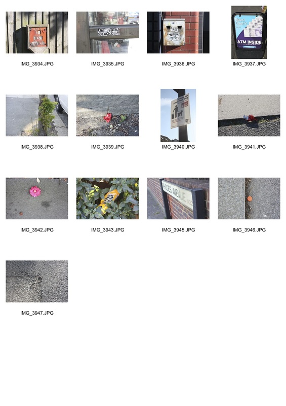
response to Wentworth
To recreate Richard's work i went on a 30 minute walk around my local area and took pictures of everyday things i saw. I like how even thought i've taken pictures of things that would normally be ignored and seen as nothing special by making them the main focus of the image it draws attention to them and allows them to be seen in a different light.
3 strands
strand 1- order and disorder
Todd Mclellan- things come apart Things Come Apart is an expansion of the original Disassembly Series. This new set of images explores retro to modern daily items that have, are, or will be in our everyday lives.
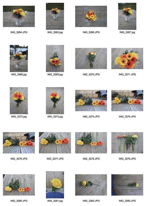
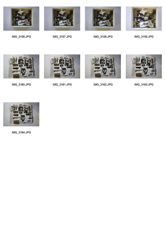
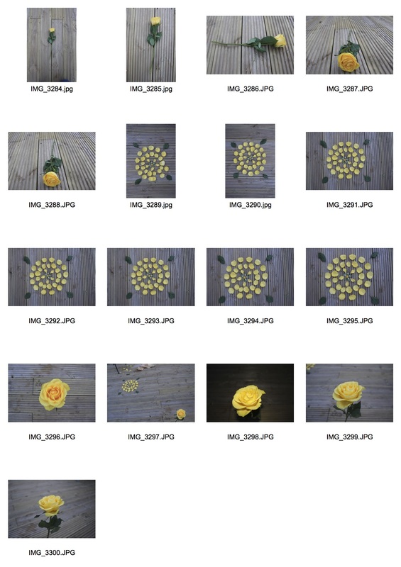
reponse to Todd Mclellan
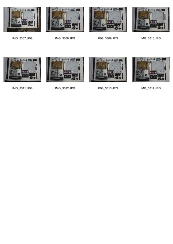
I liked this idea of stripping objects down to their pure elements. I first experimented using flowers in a bouquet showing them as a bunch and then as individual flowers grouped into colour and style. I then went on to photograph a single rose by its self and then proceeded to deconstruct it. I also did this with a box of bits and pieces i found in my photography room and also an old video player. once i had collected all of my images i chose one of the constructed images and one of the deconstructed ones from each shoot and then used photoshop to adjust the levels and saturation of the images.
|
|
Strand 2- symmetry
Daniel Mercadante-Daniel Mercadante is an American filmmaker and artist. He began making films as a young child. He is the founder of the filmmaking collective Everynone. His films have gained worldwide recognition through online popularity; earning him recognition at The Guggenheim Museum in New York City
|
|
Beginning+End Fire+Ice
Ball+Net Love+war Wet+Dry Heart+Soul Coca cola + Pepsi Life+Death Salt+Pepper Brother+Sister Cop+Robber Predator+Prey Man+Woman In+Out Cloud+Puddle Medicinal+Recreational Religion+Science Natural+Artificial |
Response to David Mercadante
In response to David Mercadante i decided to recreate his symmetry work with images. I got objects around my house that i thought were opposites ( e.g artificial and natural light). I then photographed them in the same locations and then displayed them next to each other. i like the relationship this shows as there are many symmetries in every day life that we don't even notice.

|
|
|
|
|
|
strand 3- society and perfection
Barbara Kruger
Kruger layers photographs she finds from existing sources such as magazines with aggressive and hard hitting text that involves the viewer in the struggle for power and control . In their trademark white letters against a red background, some of her most recognizable slogans are “I shop therefore I am,” and “Your body is a battleground.". Many of her quotations question the viewer about feminism, classicism, consumerism, and individual autonomy and desire, although her black-and-white images are from magazines and she has not taken them herself, the fact they are from real life magazines people buy on a daily basis sell the very ideas she is disputing
Response to Barbara Kruger
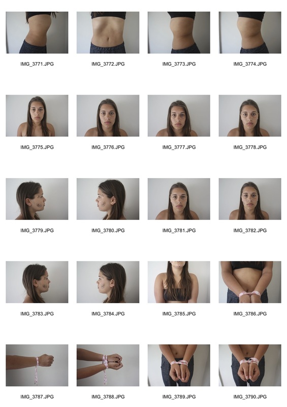
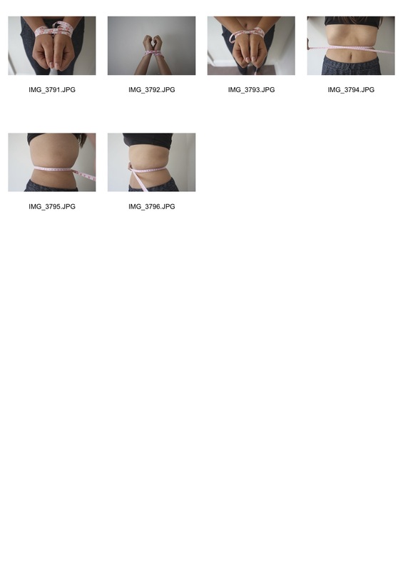
As response to Barbara's work i decided to show the ways in which the media puts pressure on young girls to fit into certain criteria in order to be considered 'beautiful'. I first took pictures of my model with markings on her face similar to the ones plastic surgeons put on the faces of their patients representing the ways in which people feel the need to change their appearances in order to fit in . I then also took a series of images of my model with a measuring tape wrapped around certain parts of her body to represent the way people are restrained by the admiration to fit into the ideal image that magazines portray. I then used photoshop to make my images black and white like how a lot of Barbara's are, and added a red boarder and banner across the middle of the images. I then added quotes across the images like Barbara does to comment on the issue i was trying to portray. Doing this response gave me the idea to begin to look at the ways in which the media create an ideal image for how young women should look and act and how this causes people to try and fit into these impossible ideals which can lead to mental disorders such as anorexia and anxiety.
|
|
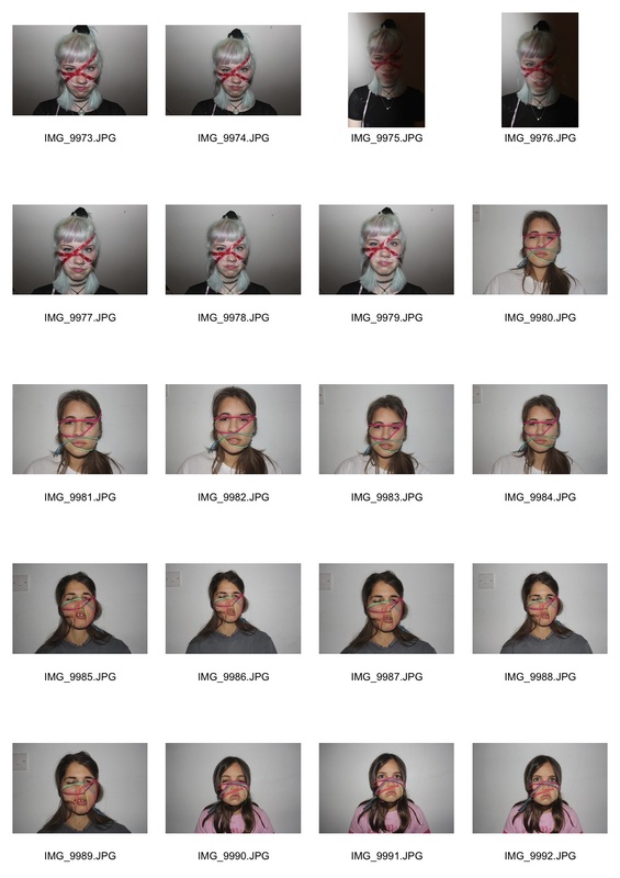
Natalia Pereira-Dismorfobina: Barcelona-based artist Natalia Pereira's photo series titled "Dismorfobina" explores the deformation of our identity when we desperately try to fit into a perfect mold that is not our own. The photographs brings attention to body dysmorphic disorder (BDD), a mental illness involving body image issues that results in depression and social phobia. According to the artist, Dismorfobina is a “disorder suffered by those who have been dominated by the habits of consumerism." I decided to create a response to Natalia as i think that her work accurately conveys the idea i was having about how the media can cause people to force themselves to fit into a impossible ideal. Her work represents this idea in a very literal way and i quite like the way it is physically showing something that normally, is invisible.
response to Natalia Pereira
In response to Natalia i recreated her Dismorphobia pictures by getting a piece of elastic and wrapping it around my models face to cause their faces to become contorted. I then used to Photoshop to desaturate my pictures to give them a similar effect to Natalia's.
Francesca woodman
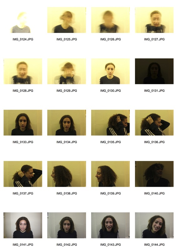
Francesca Woodman is an american photographer who was born in 1958 she is famous for her pictures that include a lot of nude,young females. She also experiments with using long exposures which cause the models faces to become blurred. Her work is the subject of much critical acclaim.
Response to Francesca Woodman
I like Francesca's work as the long exposures led to blurred faces on her models. I thought that I could use this technique to create a sense of stress and lack of stability in someones mind. To achieve this i put my camera on a tripod and set it to the BULB setting this meant i could control how long the shutter was kept open, i then got my model to stand in front of the camera and move her head around as if she was in distress as i held down the shutter button. I then put the shots i got into Photoshop and changed the saturation and levels to achieve the washed out and distressed look that Francesca has in her images. I also experimented with using the burn tool to darken some of the blurred parts of the image so they could be distinguished as a facial feature and not just a blur on the page.
|
|
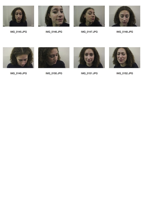
Kalliope Amorphous
Kalliope Amorphous is a photographer who is best known for her work in self-portrait photography. In many of her images she is the model, stylist, and photographer. she uses the image of herself as the main character in her pictures to create the "visual stories" she tries to convey through her photography.Being a self-taught photographer, Amorphous has created her own alternative processes using homemade and alternative lighting. As well as this she experiments with textiles, surfaces, mirrors, and in-camera distortion techniques. Amorphous uses reflections, blur, mirrors, and multiple exposure in a lot of her work to represent many of her preferred themes such as identity, mortality, time, and consciousness.
Response to Kalliope Amorphous
I used Kalliope's work with reflections as inspiration for my ideas about mental disorders . I felt her methods created a sense of multiple personalities with in the single image. i decided to create a response to her work showing two figures of the same person in a single image. I liked this as i thought it could represent multiple personality disorder ( otherwise known as bipolar) quite well. To create these images i set my camera on a tripod so i would not move it in between shots. i then got my model to pose in the frame looking normal and took a shot, after this i got her to do a second pose in the same frame and look crazy/distressed. I then layered these images in Photoshop and used the history brush tool to reveal both figures in the same frame. I experimented with the opacity of the history brush tool so some images would look like the second figure was ghost like. i liked this effect as i thought it represented the fact that these secondary characters aren't actually who the sufferers are, but just a side effect of their disorder. i also liked it as i thought it showed that these disorders can affect anyone and that someone who may look completely healthy and normal in fact is hiding a part of themselves so they are able to fit into society. This idea of people hiding parts of themselves to fit into society links back to my initial idea of the media creating an ideal for people to fit into.
|
|
Second response to Kalliope Amorphous (final piece)
I liked this idea of multiple personalities, and so decided to develop my response to Amorphous. This time i used more figures in each image as i thought this would give more of an impact. I initially used 6 different locations for this development but then decided on just using 5 in my final pieces as i felt that 2 of my locations were too similar. Below is a slideshow of how i created my final images in photoshop.
|
|
|
